Evaluating prediction models with respect to benefit
I recently wrote a paper and Wikipedia article on decision curve analysis with one of its co-creators, Dr. Andrew Vickers. I learned a lot about the method over the course of these projects but I found most of the existing materials on decision curve analysis to be dense and hard to digest. I decided to write this blog post to offer a (hopefully) more accessible resource, and to showcase the dcurves package that was implemented by Daniel Sjoberg.
Why do we need decision curve analysis?
One of the main benefits of prediction models is that they can help us make better decisions. A prediction model can provide personalized estimates of the probability of an event and tell us how confident we should be in the estimates. When the estimates are good, we can factor them into our decision and improve our outcomes on average. But the most common methods for determining whether a prediction model is “good” do not take our preferences or the decision consequences into account. That is why we need decision curve analysis: to tell us whether it is worth it to use a prediction model given the circumstances of our decision.
For example, say we are trying to decide whether to perform invasive biopsies on a group of subjects to confirm the presence of cancer. We want to biopsy subjects who have cancer so they can benefit from appropriate treatment, but not those who do not have cancer, since the biopsy itself could cause harm in the form of negative side effects or surgical complications. To maximize the benefit and minimize the harm of our decisions, we can predict the risk of cancer for each subject and only biopsy those with reasonably high risks. A “reasonably high” risk in this case would depend on both the subject’s worry about cancer and their concern about the biopsy procedure. Typically, we would decide whether a model is good enough to guide this decision based on two criteria: discrimination and calibration. Discrimination tells us how well a model can distinguish between outcome classes. If the outcome is cancer, a model with good discrimination would predict high risks of cancer for subjects who have cancer and low risks for those who do not. It is usually measured by the area under the curve (AUC), which is obtained from a receiver operating characteristic (ROC) plot. The AUC ranges from 0.5, the discrimination of a coin flip, to 1, perfect discrimination.
Since AUC is just a measure of accuracy, it does not necessarily tell us if the model will benefit our decision making. For instance, if there were two models, one that predicted 50% cancer risk for everyone who did not have cancer and 60% for everyone who did, and another that predicted 5% and 6% risks for the same groups, both models would have AUCs of 1, since they were able to discriminate perfectly between cancer and non-cancer cases. However, in the first case just about everyone would choose to have a biopsy due to their high risks of cancer, and in the second case most people would not. So two models with perfect discrimination can lead us to different decisions, which, depending on the aggressiveness of the cancer and the surgical risks of biopsy, result in different benefit and harm outcomes.
Calibration is usually measured by plotting observed outcomes against predicted outcomes, where a slope of 1 indicates perfect agreement between the two. The problem here is that a model can be well calibrated for one population or data set and not for another, so a “well-calibrated” model is not necessarily calibrated to the decision and population at hand. It is also difficult to say how much miscalibration we would be too much for a model to be useful.
The takeaway from this discussion is that if we want to know whether a prediction model will change our decisions and improve our outcomes, we need techniques other than discrimination and calibration.
What is decision curve analysis?
Traditional decision analytic methods can serve as alternatives to discrimination and calibration. In the example of biopsy for cancer, we could assign utility values to all four possible outcomes: biopsy and find cancer, biopsy and find no cancer, do not biopsy and cancer is present, and do not biopsy and cancer is not present. From there we could calculate and compare the expected utility values for our predicted cancer risk to determine whether it is worth it to biopsy. The trouble is that specifying all of these utilities is not practical, especially when we are looking at decisions for a large number of subjects.
Decision curve analysis avoids this issue with a simple observation: the risk threshold between 0% and 100% that is high enough for us to take action expresses the relative values we place on decision outcomes. For instance, if someone would opt for a biopsy if their risk of cancer were 10% or greater, but not if it were lower, we can infer that they value finding cancer early 9 times more than the risks of having an unnecessary biopsy. We call this threshold the threshold probability, $ p_t $, and use it to calculate the net benefit of a prediction model.
In this calculation, true positive predictions (biopsies performed on subjects with cancer) add benefit, and false positive predictions (biopsies performed on subjects without cancer) subtract harm. To take our preferences into account, $ p_t $ is used like an exchange rate between benefit and harm. If $ p_t $ is 10%, the harm of receiving an unnecessary biopsy is divided by 9 because the benefit of detecting cancer is considered 9 times greater.
To evaluate a model, we plot the net benefit against threshold probability for a range of reasonable thresholds. For example, we could reason that most people would not want a biopsy if their risk of cancer were less than 5%, but most people would choose to have a biopsy if their risk were 20%. In this case, we would create a plot showing the net benefit of our prediction model against $ p_t $ ranging from 0.05 to 0.20. This is called the decision curve for the model.
The x-axis, $ p_t $, can be interpreted as preference, and it shows the risk thresholds for which we would decide to take an action, like having a biopsy for cancer. The y-axis, net benefit is expressed in units of true positives per person. For instance, a difference in net benefit of 0.025 at a given threshold probability between two predictors of cancer, Model A and Model B, could be interpreted as “using Model A instead of Model B to order biopsies increases the number of cancers detected by 25 per 1000 patients, without changing the number of unnecessary biopsies.” By convention, we also plot the decision curves for the default strategies of treating all subjects and treating no subjects. This is because they are often reasonable alternatives and serve as useful comparisons for the model. The decision curve with the highest net benefit over the entire range of threshold probabilities is chosen as the best strategy to maximize net benefit.
Example using the dcurves package in R
We can demonstrate decision curve analysis in action using the df_binary data set and functions made available by dcurves. We will use the same example of predicting cancer risk to determine whether or not to biopsy. To demonstrate the shortcomings of AUC for decision making, we will develop a ridge regression model and a support-vector machine (SVM) model and compare them on AUC, and then apply decision curve analysis for additional insight.
First, we partition the data into training and test data sets so that we can train and validate our models.
# set seed to reproduce results
set.seed(10)

# load cancer data
data("df_binary")

# make cancer outcome a factor for caret functions
data <-
  df_binary %>%
  mutate(
    cancer = case_when(
      cancer == TRUE ~ "yes",
      cancer == FALSE ~ "no"
    ) %>% factor()
  )

set.seed(10)
# partition into training and test sets
train_rows <-
  createDataPartition(
    y = data %>% pull(cancer),
    p = 0.70,
    list = FALSE
  )

# training data
df_train <- data[train_rows, ]
train_y <- df_train %>% pull(cancer)

# testing data
df_test <- data[-train_rows, ]
test_y <- df_test %>% pull(cancer)

# set cross validation parameters for training
ctrl <- trainControl(
  method = "repeatedcv",
  number = 10,
  repeats = 5,
  summaryFunction = twoClassSummary,
  classProbs = TRUE
)
Now we can train our prediction models on the training data set using functions from the caret package. We will use age, family history of cancer, and a cancer marker as the predictors.
Train a ridge regression model and predict values for the test data set.
set.seed(10)
# train ridge model
fit_ridge <-
  train(
    x = df_train %>% select(age, famhistory, marker),
    y = train_y,
    method = "glmnet",
    tuneGrid = expand.grid(alpha = 0, lambda = exp(seq(-2, -1, length = 100))),
    preProc = c("center", "scale"),
    trControl = ctrl
  )

set.seed(10)
# add ridge predictions to the test set
df_test <-
  df_test %>%
  mutate(
    pred_ridge = predict(
      fit_ridge,
      newdata = df_test %>% select(age, famhistory, marker),
      type = "prob")[, "yes"],
    pred_ridge_val = predict(
      fit_ridge,
      newdata = df_test %>% select(age, famhistory, marker),
      type = "raw")
  )
Train the SVM model and predict values for the test data set.
set.seed(10)
# train svm model (this takes a while)
fit_svm <-
  train(
    x = df_train %>% select(age, famhistory, marker),
    y = train_y,
    method = "svmLinear",
    preProcess = c("center","scale"),
    tuneGrid = data.frame(C = exp(seq(-10, 25, len = 20))),
    metric = "ROC",
    trControl = ctrl
  )

set.seed(10)
# add svm predictions to the test set
df_test <-
  df_test %>%
  mutate(
    pred_svm = predict(
      fit_svm,
      newdata = df_test %>% select(age, famhistory, marker),
      type = "prob")[, "yes"]
  )
With the two candidate models developed, we can assess their performance.
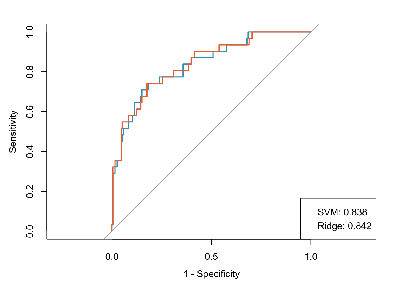
Let’s assume that both of these models are well calibrated (this isn’t exactly true because the ridge regression model wasn’t trained on the optimal grid for demonstration purposes). Both models have good discrimination, with AUCs of 0.842 and 0.838 for the ridge and SVM models, respectively. However, it is difficult to decide which model to use since the values are so similar.
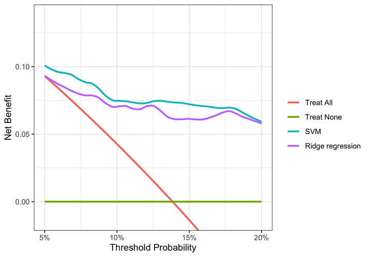
Situations like this are exactly what decision curve analysis was designed for. We’ll use the dca function from dcurves to calculate the net benefit for our models across the 5% to 20% threshold probability range.
Decision curve analysis
dca <- dca(
  cancer ~
    pred_svm +
    pred_ridge,
  data = df_test,
  thresholds = seq(0.05, 0.20, by = 0.001),
  label = list(
    cancerpredmarker = "Prediction Model 1",
    pred_glm = "GLM",
    pred_svm = "SVM",
    pred_ridge = "Ridge regression")
)

dca %>% plot(smooth = TRUE)
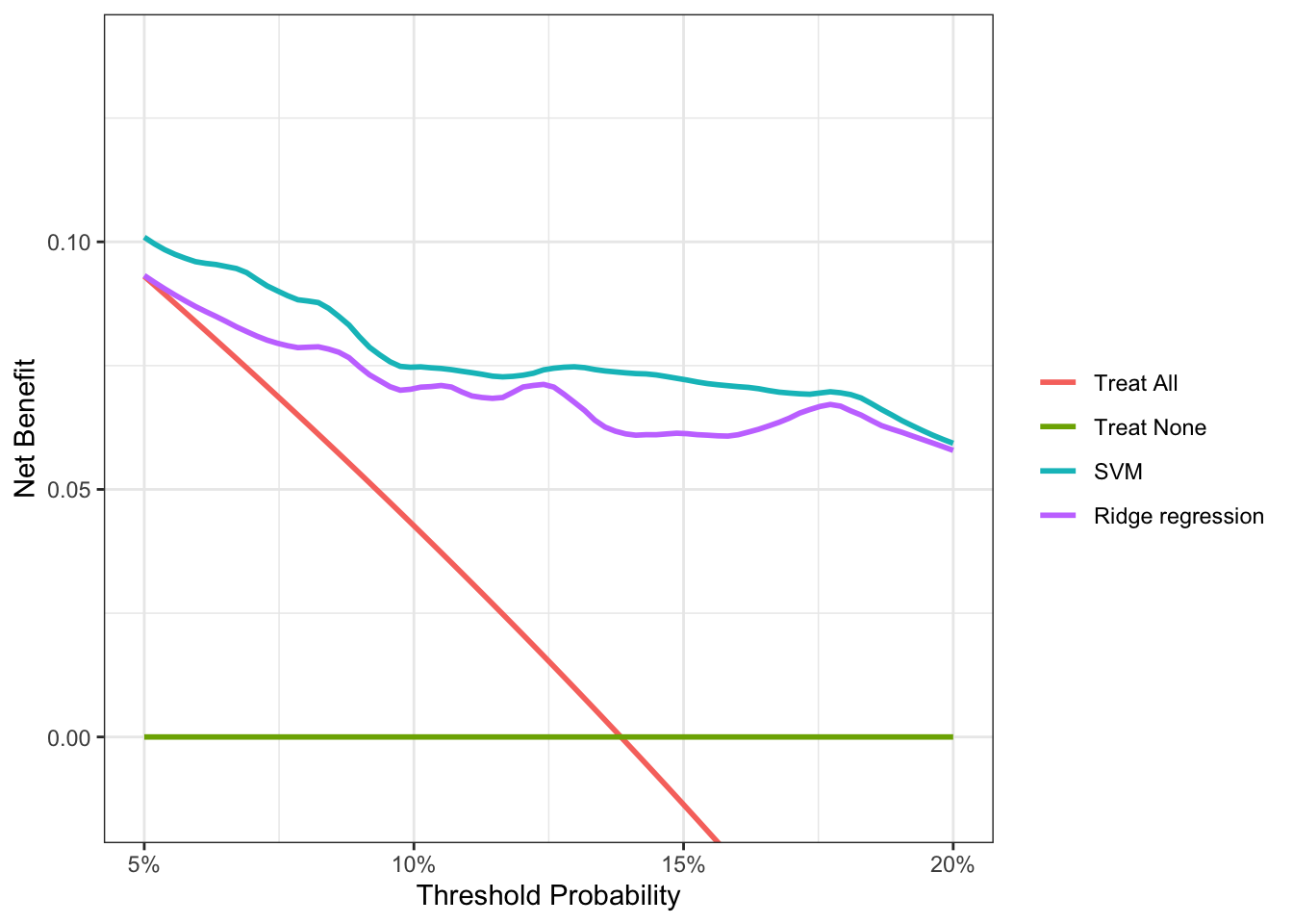
Decision curve analysis reveals that the SVM model has a higher net benefit than the ridge regression across the full range of reasonable threshold probabilities. So despite its marginally lower performance on AUC, it’s clear that the SVM model will provide better outcomes if we use it to determine which subjects to biopsy for cancer. For someone with a threshold probability of 15%, the difference in net benefit between the SVM and ridge models is 0.0076. This result tells us that using the SVM model instead of the ridge model to decide who to biopsy, the number of cancers detected increases by 76 per 10,000 subjects, without changing the number of unnecessary biopsies.
If you’re interested in learning more about decision curve analysis, there are great resources available at decisioncurveanalysis.org.