Plotting GEE predictions over observed values
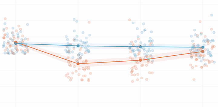
This is a mini post documenting the function I wrote to plot estimated quality of life scores and lab values over time for a study on focal therapy for prostate cancer. The plot shows the number of observations at each timepoint and can be stratified by a binary variable in the dataset.
For the prostate cancer focal therapy project described in this post, we wanted to visualize our predicted outcomes and show the full distribution among our cohort at each study timepoint. We ended up deciding to plot all of the observed data points alongside our predictions.
Creating a function to produce these plots presented some technical challenges, including the need for an option to stratify by binary variables and display the number of cases at each timepoint, so I wanted to share the solutions I came up with here as documentation for myself and for anyone who encounters similar situations.
To demonstrate the function, I’m using the Treatment of Lead- Exposed Children (TLC) trial data set. I randomly added missing values so that the timepoints would have different numbers of observations, as was the case in our study. The data set is structured as:
| id | visit | measure | group |
|---|---|---|---|
| 1 | Baseline | 30.8 | 0 |
| 1 | Week 1 | 26.9 | 0 |
| 1 | Week 4 | 25.8 | 0 |
| 1 | Week 6 | 23.8 | 0 |
| 2 | Baseline | NA | 1 |
| 2 | Week 1 | 14.8 | 1 |
For data in this format, we can call the function plot_gee_fit to produce plots like the one featured above.
plot_gee_fit(
  data = df,
  time = visit,
  outcome = measure,
  id = id,
  # by = group,
  timepoints = c("Baseline", "Week 1", "Week 4", "Week 6"),
  y_label = "Mean blood lead levels (micrograms/dL)",
  x_label = "Time",
  title = "Effect of chelation treatment with succimer on blood lead levels",
  y_limits = c(0, 71),
  y_breaks = seq(0, 70, 10)
)
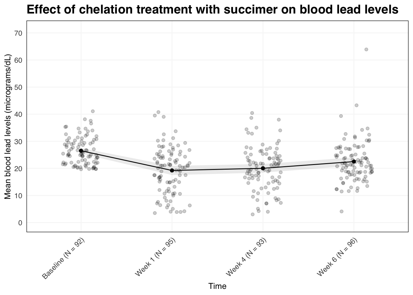
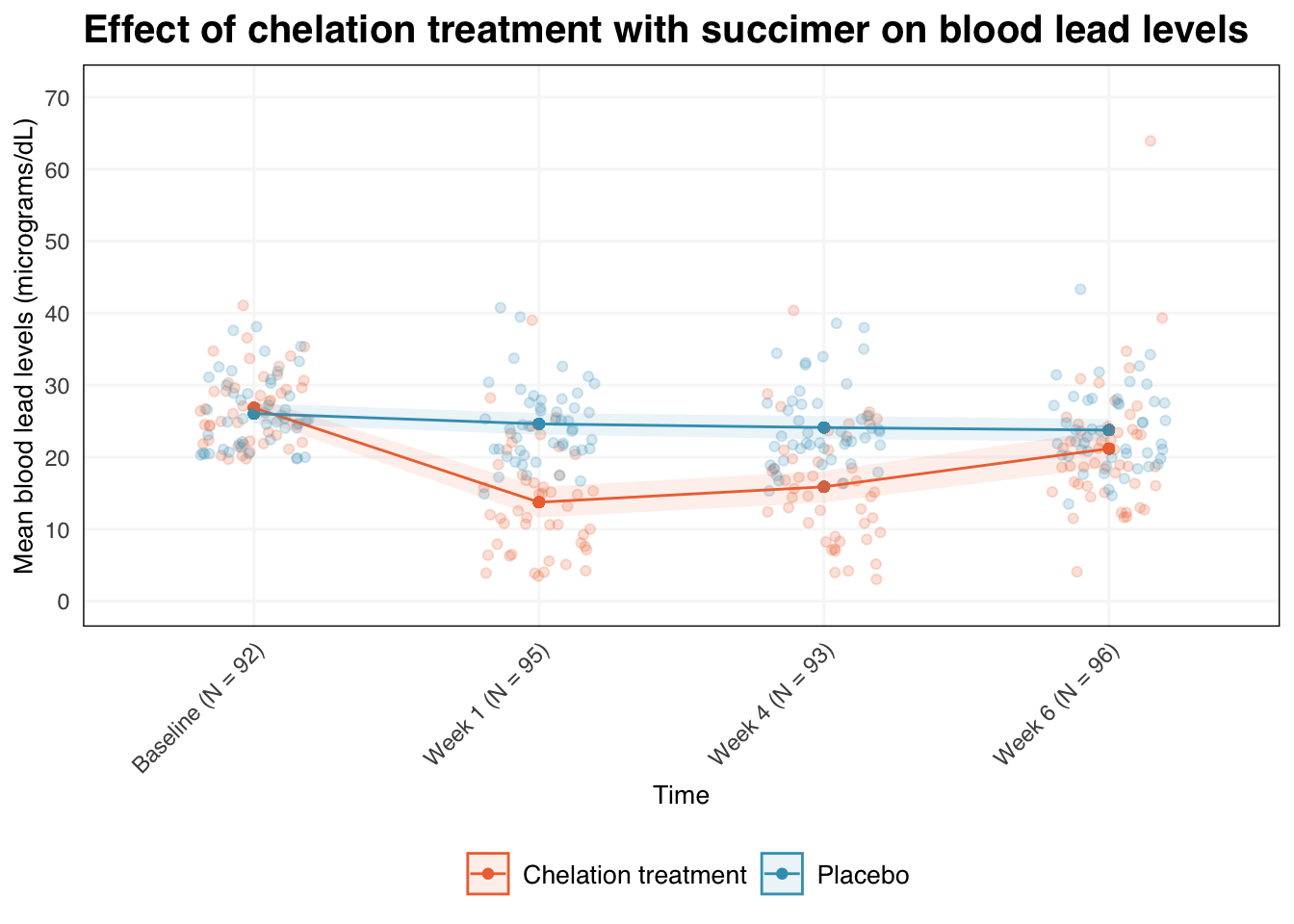
The function requires timepoint, outcome, and ID variables, and also has inputs to set the plot labels and y-axis range. We can also specify a variable to stratify the analysis by as below.
plot_gee_fit(
  data = df,
  time = visit,
  outcome = measure,
  id = id,
  by = group,
  timepoints = c("Baseline", "Week 1", "Week 4", "Week 6"),
  y_label = "Mean blood lead levels (micrograms/dL)",
  x_label = "Time",
  group_level1 = "Chelation treatment",
  group_level0 = "Placebo",
  group_lab = "",
  title = "Effect of chelation treatment with succimer on blood lead levels",
  y_limits = c(0, 71),
  y_breaks = seq(0, 70, 10)
)
The code for plot_gee_fit and its helper functions is documented below.
Helper function to create GEE models.
# function to fit model
create_model <- function(data, outcome, time, id) {
  fit <-
    geepack::geeglm(
      outcome ~ time - 1,
      data,
      id = id,
      family = gaussian,
      corstr = "exchangeable"
    ) %>%
    broom::tidy(conf.int = TRUE)

  fit
}
Plot theme presets for ggplot.
text_color <- "black"

my_theme <- theme_minimal() + theme(
  panel.grid.major.y = element_line(color = "grey97"),
  panel.grid.minor.y = element_blank(),
  panel.grid.minor.x = element_blank(),
  panel.grid.major.x = element_line(color = "grey97"),

  text = element_text(family = "sans"),

  plot.title = element_text(size = 15, color = text_color, face = "bold"),
  plot.subtitle = element_text(size = 12, color = text_color),
  plot.caption = element_text(hjust = 0, color = text_color),
  # figure label
  plot.tag = element_text(color = text_color),

  axis.title.x = element_text(size = 10, color = text_color),
  axis.title.y = element_text(size = 10, color = text_color),

  strip.text = element_text(size = 10, color = text_color, face = "plain"),

  legend.title = element_text(size = 10, color = text_color),
  legend.text = element_text(size = 10, color = text_color),
  legend.box.background = element_blank(),
  legend.position = "bottom",

  panel.spacing = unit(1, "lines"),
  panel.border = element_rect(color = "black", fill = NA),
)
Helper function to create plot
create_plot <- function(data, title, x_label, y_label, group_lab, y_limits, y_breaks) {
  # set aesthetics based on stratification
  if (!is.null(data$by)) {
    plt <- data %>%
      ggplot(aes(x = time_n, y = estimate, color = by, fill = by, group = by))
  } else {
    plt <- data %>%
      ggplot(aes(x = time_n, y = estimate, group = 1))
  }
  # create plot
  plt +
    geom_point() +
    geom_jitter(aes(y = outcome), position = position_jitter(0.2), alpha = 0.2) +
    geom_line() +
    geom_ribbon(aes(ymin = conf.low, ymax = conf.high, color = NULL), alpha = .1) +
    labs(
      title = title,
      x = x_label,
      y = y_label,
      color = group_lab,
      fill = group_lab
    ) +
    scale_color_viridis_d(option = "plasma", end = 0.7) +
    scale_fill_viridis_d(option = "plasma", end = 0.7) +
    scale_y_continuous(limits = y_limits, breaks = y_breaks) +
    my_theme +
    theme(axis.text.x = element_text(angle = 45, hjust = 1))
}
Function to format and plot data.
plot_gee_fit <-
  function(data, outcome, time, id, by = NULL, timepoints, x_label = NULL, y_label = NULL, group_lab = NULL, group_level1 = NULL,  group_level0 = NULL, title = NULL, y_limits = NULL, y_breaks = NULL) {

    # make variable names accessible
    arguments <- as.list(match.call())

    # indicator for whether a stratification variable has been specified
    stratify <- !is.null(arguments$by)

    # remove null elements
    arguments <- arguments[lengths(arguments) != 0]

    # get vector of relevant column names from the data argument
    data_names <- intersect(c(as.character(arguments$outcome), as.character(arguments$time), as.character(arguments$id), as.character(arguments$by)), names(data))

    # get names of relevant arguments that were specified
    arg_names <- intersect(c("outcome", "time", "id", "by"), names(arguments))

    # make argument names referenceable
    data <- data %>% select(data_names) %>% set_names(arg_names) %>%
      filter(time %in% timepoints)

    # create model; if 'by' is specified, create two stratified models
    if (stratify == TRUE) {
      # create model for by = 1
      fit1 = create_model(data %>% filter(by == 1), outcome, time, id) %>%
        mutate(by = 1)
      # create model for by = 0
      fit2 = create_model(data %>% filter(by == 0), outcome, time, id) %>%
        mutate(by = 0)
      # bind model results
      fit <- bind_rows(fit1, fit2)
    } else {
      # create model
      fit <- create_model(data, outcome, time, id)
    }

    # update time variable to be consistent with original data
    fit <- fit %>% mutate(
      time = term %>% str_remove(pattern = "time") %>% factor(levels = timepoints),
    )

    # join in raw data to plot score points in addition to estimated means
    data <- left_join(
      fit,
      data,
      by = c(arg_names[!arg_names %in% c("id", "outcome")])
    ) %>%
      drop_na(outcome) %>%
      group_by(time) %>%
      mutate(
        # create numeric visit order to reorder visit field containing the number of observations
        time_order = time %>% str_remove("Week ") %>% str_replace("Baseline", "0") %>% as.numeric(),
        time_n = str_glue("{time} (N = {n()})") %>% factor() %>% fct_reorder(time_order)
      ) %>%
      ungroup()

    if (stratify == TRUE) {
      # convert binary group to factor for legend display
      data <- data %>%
        mutate(
          by = case_when(
            by == 1 ~ group_level1,
            by == 0 ~ group_level0
          ) %>% factor(levels = c(group_level1, group_level0))
        )
    }

    create_plot(data, title, y_limits = y_limits, y_breaks = y_breaks, x_label, y_label, group_lab)
  }