Visualizing the toll of COVID-19
Earlier this year, a lecturer at my office presented this visualization of COVID-19 deaths by the New York Times. The graphic struck me. I found it both beautiful and powerful. I’ve seen a lot of data visualizations throughout the pandemic, but none of them communicated the toll that COVID has taken as effectively as this one. Seeing a black dot for every individual in the U.S. who lost their life to COVID was moving. As the presenter scrolled down the graphic, through case spikes where the dots are so dense that the column turns nearly black, I realized that I hadn’t grasped the devastation that the pandemic has caused.
Because I found the figure so effective and impactful, I was curious whether it could be reproduced and automated in R to use for other time-to-event applications. Thanks to the incredibly customizable ggplot2 package, I was able to reproduce the graphic closely. Here I’m documenting the steps I took for myself and anyone interested creating similar plots or learning more about data visualization in R.
A major limitation, however, was the run time for ggplot. Because I included some HTML and CSS code to create the text annotations, the graphic takes hours to render in R. So I started by simulating a small data set to test the plot.
Data setup
df <-
  tibble(
    date = seq.Date(ymd("2000-01-01"), ymd("2000-02-19"), by = "day"),
    y = 1:length(date) %>% as.double(),
    x = runif(length(date)),
    cumulative_deaths = cumsum(!is.na(date)) * 1000
  )

# set color and font parameters
# this color was obtained by using the Firefox developer tools to view the NYT's webpage
color1 <- "#d0021b"
# this georgia font is not the exact one used by the NYT
font_family1 <- "Georgia"
font_family2 <- "Arial"
# set the threshold number of deaths to plot
# reduced to 2,500 because of run time
threshold <- 2500
I ran into several issues when I applied my code the actual COVID data, one of which (jumping ahead a few steps) was that adding jitter to the points caused them to render below the bottom of the plot, or remove my axis annotations when setting axis limits. I therefore decided to manually add jitter to the y coordinates in only one direction so that the points would not render below the x-axis:
df1 <-
  df %>%
  # add manual jitter to avoid jitter below x axis
  mutate(index = 1:nrow(df)) %>%
  group_by(index) %>%
  mutate(y_point = y - runif(1, 0, 1)) %>%
  ungroup()
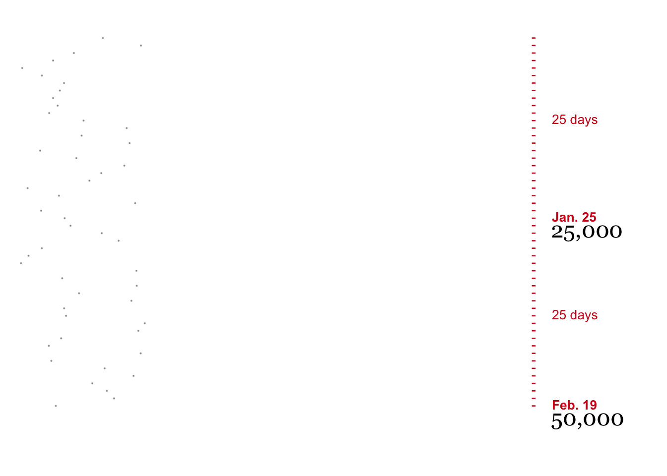
To add annotations to the y-axis, I created new columns for the abbreviated date every 25,000 deaths and the number of days between thresholds. I also created separate geom_text elements for each.
df2 <-
  df1 %>%
  mutate(
    # y value for every 25,000 deaths
    threshold_y =
      case_when(
        cumulative_deaths %% 25000 == 0 ~ y,
        TRUE ~ NA_real_
      ),
    # set last and next threshold as threshold and then use fill to replace NA
    # and get the previous and next threshold at every point
    last_threshold_y = threshold_y,
    next_threshold_y = threshold_y,
  ) %>%
  fill(last_threshold_y, .direction = "down") %>%
  fill(next_threshold_y, .direction = "up") %>%
  # replace missing values for last threshold with 0 so that time to the first threshold can be calculated
  mutate(last_threshold_y = last_threshold_y %>% replace_na(0)) %>%
  mutate(
    # days to next 25,000 deaths, positioned halfway between last and next case
    threshold_date = case_when(!is.na(threshold_y) ~ date, TRUE ~ NA_Date_),
    # format date using lubridate every 25,000 deaths
    date_lab =
      case_when(
        !is.na(threshold_y) ~ str_glue("{as.character(month(threshold_date, label = TRUE))}. {day(date)}"),
        TRUE ~ ""
      ),
    # create formatted text value for each 25,000 threshold to display in plot
    count = case_when(
      !is.na(threshold_y) ~ format(cumulative_deaths, big.mark = ","),
      TRUE ~ NA_character_),
    # use lag function to shift count value down 5 days
    count_lag = lag(count, 5)
  ) %>%
  # fill in missing values so that the next threshold date appears in the next row
  # and the interval can be calculated using "lead"
  mutate(
    # calculate point halfway between thresholds
    half_way = round(last_threshold_y + (next_threshold_y - last_threshold_y) / 2),
    # calculate and format the number of days between thresholds
    tt_threshold =
      case_when(
        y == half_way ~ str_glue("{next_threshold_y - last_threshold_y} days"),
        TRUE ~ ""
      ),
    tt_threshold = tt_threshold %>% replace(y == threshold_y, "")
  )
Creating the plot
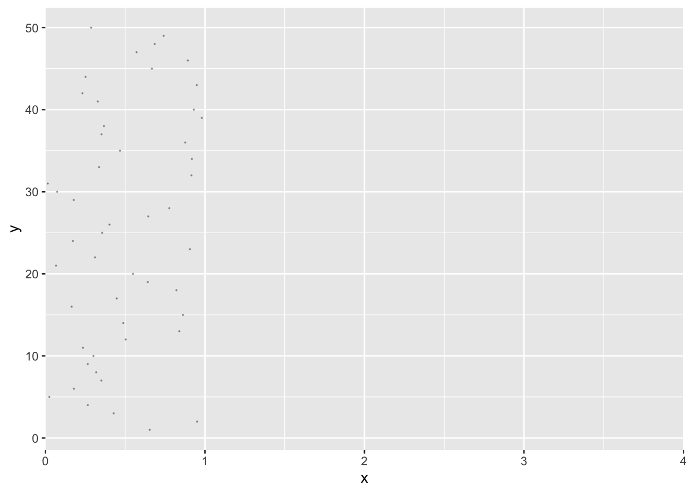
With my test data ready, I began to reproduce the plot. To create the vertical column of points, I randomly set the x value between 0 and 1, and set the full x range from 0 to 3. The expand = c(0, 0) call removes the margin between the 0 values and axis lines.
plot <-
  df2 %>%
  arrange((date)) %>%
  ggplot(aes(x = x, y = y)) +
  geom_point(alpha = 0.3, size = 0.1) +
  scale_x_continuous(limits = c(0, 4), expand = c(0, 0))

plot
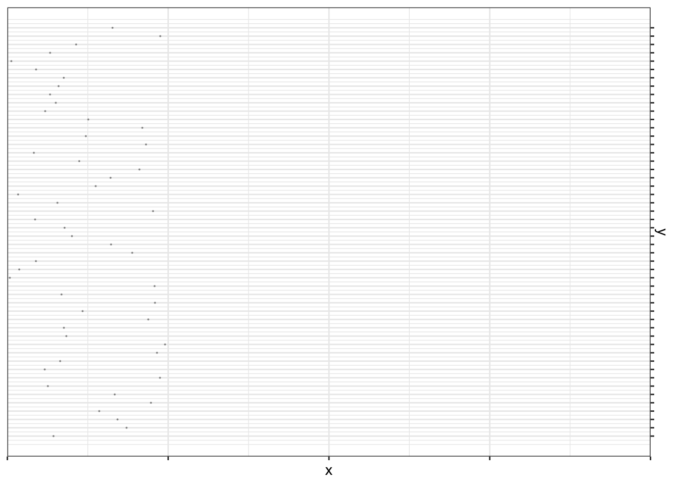
Next I used scale_y_reverse to move the y-axis to the right side of the plot and removed all axis text using theme(axis.text = element_blank()).
plot1 <-
  plot +
  scale_y_reverse(
    breaks = 1:length(unique(df$date)),
    position = "right"
  )  +
  theme_bw() +
  theme(
    axis.text = element_blank(),
  )

plot1
I also edited the theme to remove all lines and borders but keep the y-axis ticks and color them red.
plot2 <-
  plot1 +
  labs(x = "", y = "") +
  theme(
    legend.position = "",
    panel.border = element_blank(),
    panel.grid.major = element_blank(),
    panel.grid.minor = element_blank(),
    axis.text = element_blank(),
    axis.ticks.x = element_blank(),
    axis.ticks.y = element_line(color = color1, size = 0.45),
    axis.ticks.length = unit(0.1, "cm"),
    plot.margin = unit(c(1, 6, 1, 1), "lines")
  )

plot2

I used geom_textbox from ggtext package to add and format y-axis annotations. Using geom_textbox significantly affects render speed, but using geom_text was causing the colored text to render slightly faded, and the only way I figured out around the issue was to use geom_textbox and manually specify the color again in CSS. I did use geom_text for the black case count text, using the nudge_y parameter to render the text below the threshold date label.
plot3 <-
  plot2 +
  geom_textbox(
    aes(label = str_glue("<span style='color:{color1}; font-family:{font_family2}'>{date_lab}</span>"), family = font_family2, fontface = "bold", color = "color1"),
    fill = NA, label.color = NA, label.size = NA, box.colour = NA,
    x = 4.1,
    hjust = 0,
    size = 3.5
  ) +
  geom_text(
    aes(label = count, family = font_family1),
    nudge_y = -1.5,
    x = 4.15,
    hjust = 0,
    size = 6
  ) +
  geom_textbox(
    aes(label = str_glue("<span style='color:{color1}; font-family:{font_family2}'>{tt_threshold}</span>"),
        family = font_family2,
        # fontface = "bold",
        color = color1),
    fill = NA, label.color = NA, label.size = NA, box.colour = NA,
    x = 4.1,
    hjust = 0,
    size = 3.5
  ) +
  coord_cartesian(clip = "off")

plot3
I used geom_hline to create the horizatal lines every 25,000 deaths.
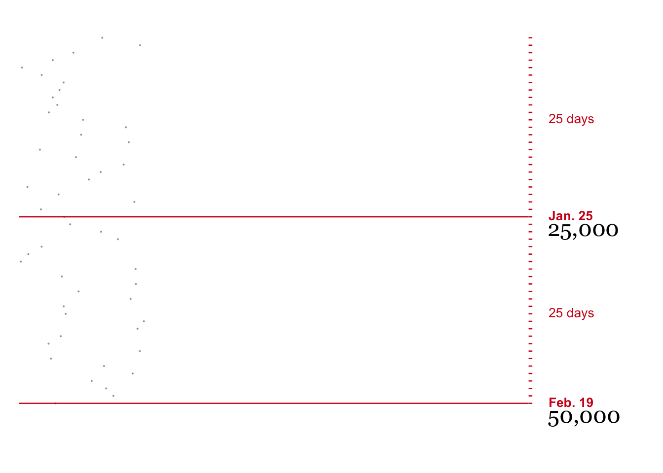
plot4 <-
  plot3 +
  geom_hline(yintercept = df2$threshold_y, color = color1, size = 0.45) +
  labs(x = "", y = "")

plot4
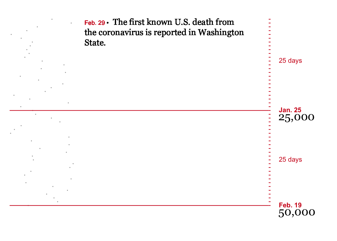
I completed the final step of creating annotations for significant events manually using geom_textbox. This allows me to insert HTML and CSS code to approximate the formatting used by the New York Times.
plot5 <-
plot4 +
geom_textbox(
aes(
label = str_glue("<span style='color:{color1}; font-family:{font_family2}; font-size: 12px;'>Feb. 29 </span><span style='color:#000000; font-family:{font_family2}; font-size: 12px;'>•</span> <span style='line-height: 1.6'>The first known U.S. death from the coronavirus is reported in Washington State.</span>"),
family = font_family1
),
width = unit(0.65, "npc"),
fill = NA, label.color = NA, label.size = NA, box.colour = NA,
x = 1.1,
y = 1,
hjust = 0,
vjust = 1.1,
size = 4.5
)
plot5
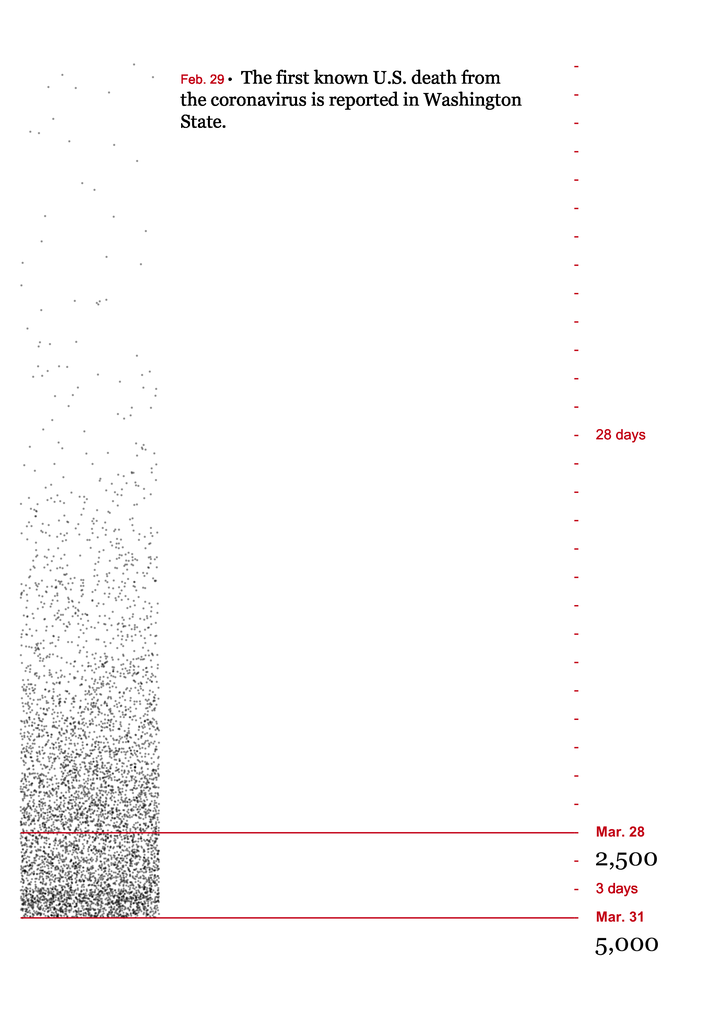
With all the pieces developed and tested, I downloaded John’s Hopkins' COVID time series data, which aggregates daily reports from the New York Times, from Github here. The ggtext annotations caused extremely long run times, so I limited the data set to the first 5,000 deaths, and set the threshold value to plot lines and case counts every 2,500 deaths.
After pivoting the data to long form, with each row representing a death from COVID, adjusting the figure height in Rmarkdown to 10, and updating the nudge_y parameter to -0.85 to fix text overlap, I used the code documented above to produce the figure below. The final code is documented below.

df_covid <-
readRDS(file = here::here("content/blog/2021-05-23-reproducing-a-new-york-times-visualization-in-r/data/df_deaths_final.Rds")) %>%
filter(cumulative_deaths < 5500) %>%
mutate(y = date %>% as.factor() %>% as.numeric())
df <-
df_covid %>%
# add manual jitter to avoid jitter below x axis
mutate(index = 1:nrow(df_covid)) %>%
group_by(index) %>%
mutate(y_point = y - runif(1, 0, 1)) %>%
ungroup() %>%
mutate(
# cumulative deaths divided by threshold; used to determine whether a threshold was passed on a given day
div = trunc(cumulative_deaths / threshold),
# y value for every 25,000 deaths
threshold_y =
case_when(
div > lag(div) ~ y,
TRUE ~ NA_real_
),
# set last and next threshold as threshold and then use fill to replace NA
# and get the previous and next threshold at every point
last_threshold_y = threshold_y,
next_threshold_y = threshold_y,
) %>%
fill(last_threshold_y, .direction = "down") %>%
fill(next_threshold_y, .direction = "up") %>%
# replace missing values for last threshold with 0 so that time to the first threshold can be calculated
mutate(last_threshold_y = last_threshold_y %>% replace_na(0)) %>%
mutate(
# days to next 25,000 deaths, positioned halfway between last and next case
threshold_date = case_when(!is.na(threshold_y) ~ date, TRUE ~ NA_Date_),
# format date using lubridate every 25,000 deaths
date_lab =
case_when(
!is.na(threshold_y) ~ str_glue("{as.character(month(threshold_date, label = TRUE))}. {day(date)}"),
TRUE ~ ""
),
# create formatted text value for each 25,000 threshold to display in plot
count = case_when(
!is.na(threshold_y) ~ format(div * threshold, big.mark = ","),
TRUE ~ NA_character_),
# use lag function to shift count value down 5 days
count_lag = lag(count, 5)
) %>%
# fill in missing values so that the next threshold date appears in the next row
# and the interval can be calculated using "lead"
mutate(
# calculate point halfway between thresholds
half_way = round(last_threshold_y + (next_threshold_y - last_threshold_y) / 2),
# calculate and format the number of days between thresholds
tt_threshold =
case_when(
y == half_way ~ str_glue("{next_threshold_y - last_threshold_y} days"),
TRUE ~ ""
),
tt_threshold = tt_threshold %>% replace(y == threshold_y, "")
)
plot <-
df %>%
arrange((date)) %>%
ggplot(aes(x = x, y = y)) +
geom_point(aes(x = x, y = y_point), alpha = 0.3, size = 0.1) +
scale_x_continuous(limits = c(0, 4), expand = c(0, 0)) +
scale_y_reverse(
breaks = length(unique(df$date)):1,
position = "right"
) +
theme_bw() +
theme(
axis.text = element_blank(),
) +
labs(x = "", y = "") +
theme(
legend.position = "",
panel.border = element_blank(),
panel.grid.major = element_blank(),
panel.grid.minor = element_blank(),
axis.text = element_blank(),
axis.ticks.x = element_blank(),
axis.ticks.y = element_line(color = color1, size = 0.45),
axis.ticks.length = unit(0.1, "cm"),
plot.margin = unit(c(1, 6, 1, 1), "lines")
) +
geom_text(
aes(label = count, family = font_family1), #, fontface = "bold"),
nudge_y = -0.85,
x = 4.15,
hjust = 0,
size = 6
) +
coord_cartesian(clip = "off") +
geom_hline(yintercept = df$threshold_y, color = color1, size = 0.45) +
geom_textbox(
aes(
label = str_glue("<span style='color:{color1}; font-family:{font_family2}; font-size: 12px;'>Feb. 29 </span><span style='color:#000000; font-family:{font_family2}; font-size: 12px;'>•</span> <span style='line-height: 1.6'>The first known U.S. death from the coronavirus is reported in Washington State.</span>"),
family = font_family1
),
width = unit(0.65, "npc"),
fill = NA, label.color = NA, label.size = NA, box.colour = NA,
x = 1.1,
y = 1,
hjust = 0,
vjust = 1.7,
size = 4.5
) +
geom_textbox(
aes(label = str_glue("<span style='color:{color1}; font-family:{font_family2}'>{date_lab}</span>"), family = font_family2, fontface = "bold", color = "color1"),
fill = NA, label.color = NA, label.size = NA, box.colour = NA,
x = 4.1,
hjust = 0,
size = 3.5
) +
geom_textbox(
aes(label = str_glue("<span style='color:{color1}; font-family:{font_family2}'>{tt_threshold}</span>"),
family = font_family2,
# fontface = "bold",
color = color1),
fill = NA, label.color = NA, label.size = NA, box.colour = NA,
x = 4.1,
hjust = 0,
size = 3.5
) +
labs(x = "", y = "")