Run charts for quality improvement initiatives
This is a mini post documenting a function I wrote to plot the results of a hospital quality improvement project. The function automatically calculates and plots the pre- and post-intervention median outcome values and highlits the specified target outcome region and time period when the intervention is being implemented.
My wife is a fourth-year medical student who was recently involved in a quality improvement project for her hospital. She and her colleagues had noticed discrepancies in the way a certain health metric was recorded among clinical staff. To remedy the issue, they implemented some guidelines and training programs and then recorded the metric before and after their intervention to observe its effect.
When they had finished collecting data, I wrote a function to generate run charts so they could report their results for several subsets of the hospital.
The function requires data in this form:
## # A tibble: 6 × 4
##   readmission_rate date       intervention in_progress
##              <dbl> <date>            <dbl>       <dbl>
## 1            0.12  2021-11-15            0           0
## 2            0.13  2021-12-15            0           0
## 3            0.14  2022-01-15            0           0
## 4            0.13  2022-02-15            0           1
## 5            0.125 2022-03-15            1           1
## 6            0.1   2022-04-15            1           0
where there is an outcome measurement, a timepoint variable, an indicator for whether the timepoint is post-intervention, and another indicator for the timepoints during which the intervention was in progress.
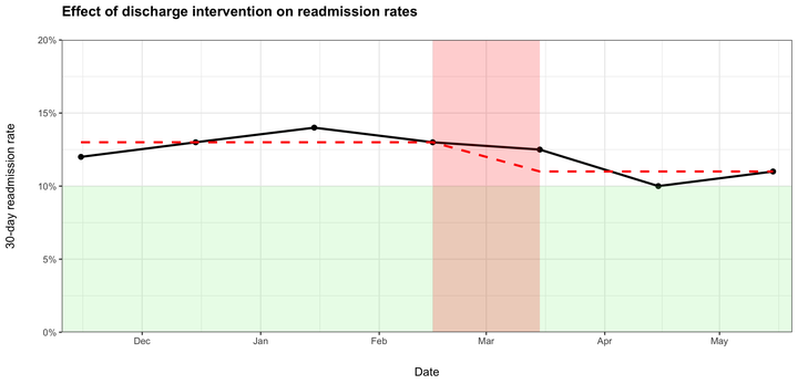
In this example, a hypothetical hospital hopes to reduce its 30-day readmission rate to 10% by implementing new discharge procedures. Using the simulated data in this form, we can produce a run chart.
The red dashed line represents the median monthly readmission rate before and after the discharge procedures were changed. The red shaded area shows the time period when clinical staff were being trained on the updated procedures. The green shaded region shows the target readmission rate range that the hospital hopes to achieve.
The code to produce this figure is documented below.
run_chart <- function(x, date, intervention, in_progress, data, target, y_min, y_max, x_label, y_label, title) {
  # make variable names accessible
  arguments <- as.list(match.call())

  # remove null elements
  arguments <- arguments[lengths(arguments) != 0]

  target <- eval(arguments$target)
  y_min <- eval(arguments$y_min)
  y_max <- eval(arguments$y_max)
  y_min <- eval(arguments$y_min)
  y_label <- eval(arguments$y_label)
  title <- eval(arguments$title)
  x_label <- eval(arguments$x_label)

  # get vector of relevant column names from the data argument
  data_names <- c(
    as.character(arguments$x),
    as.character(arguments$date),
    as.character(arguments$intervention),
    as.character(arguments$in_progress)
  )

  arg_names <- c("x", "date", "intervention", "in_progress")

  # make argument names referenceable
  data <- data %>% select(data_names) %>% set_names(arg_names)

  # calculate median outcome rates
  data <- data %>%
    group_by(intervention) %>%
    mutate(median_by = median(x, na.rm = TRUE)) %>%
    ungroup() %>%
    group_by(in_progress) %>%
    mutate(
      int_start = case_when(
        in_progress == 1 & date == min(date, na.rm = TRUE) ~ date,
        TRUE ~ NA_Date_
      ),
      int_end = case_when(
        in_progress == 1 & date == max(date, na.rm = TRUE) ~ date,
        TRUE ~ NA_Date_
      )
    ) %>%
    ungroup()

  first_date = data %>% filter(date == min(date, na.rm = TRUE)) %>% pull(date)
  last_date = data %>% filter(date == max(date, na.rm = TRUE)) %>% pull(date)

  x_int_start = data %>% filter(!is.na(int_start)) %>% pull(int_start)
  x_int_end = data %>% filter(!is.na(int_end)) %>% pull(int_end)

  y_int_start = data %>% filter(date == int_start) %>% pull(x)
  y_int_end = data %>% filter(date == int_end) %>% pull(x)

  # plot data
  data %>%
    ggplot(aes(x = date, y = x)) +
    geom_point(size = 2) +
    geom_line(size = 1) +
    geom_segment(
      aes(x = x_int_start, xend = x_int_end, y = y_int_start, yend = y_int_end),
      linetype = "dashed", color = "black"
    ) +
    geom_line(aes(y = median_by), size = 1, linetype = "dashed", color = "red") +
    annotate(
      geom = "rect",
      xmin = first_date - 5, ymin = 0, xmax = last_date + 5, ymax = target,
      fill = "light green", alpha = 0.2
    ) +
    annotate(
      geom = "rect",
      xmin = x_int_start, ymin = y_min, xmax = x_int_end, ymax = y_max,
      fill = "red", alpha = 0.2
    ) +
    scale_y_continuous(expand = c(0, 0), limits = c(y_min, y_max), labels = scales::percent_format(accuracy = 1)) +
    scale_x_date(expand = c(0, 0), limits = c(first_date - 5, last_date + 5)) +
    labs(
      x = x_label,
      y = y_label,
      title = title
    ) +
    theme_bw() +
    theme(
      axis.title.y = element_text(margin = margin(t = 0, r = 20, b = 0, l = 0)),
      axis.title.x = element_text(margin = margin(t = 20, r = 0, b = 0, l = 0)),
      plot.title = element_text(face = "bold", margin = margin(t = 0, r = 0, b = 20, l = 0))
    )
}
run_chart(
  x = readmission_rate,
  date = date,
  intervention = intervention,
  in_progress = in_progress,
  data = df,
  target = 0.1,
  y_min = 0,
  y_max = 0.2,
  x_label = "Date",
  y_label = "30-day readmission rate",
  title = "Effect of discharge intervention on readmission rates"
)